When I went to Manito’s website, I noticed many design issues that made the design look outdated and chaotic.
When I went to Manito’s website, I noticed many design issues that made the design look outdated and chaotic.
Too many Sections
Unnecesary animations
Unnecessary Socials, they most likely just came from these apps

Inconsistent spacing
Different Buttonsize
Different Buttoncolor
The website's structure also didn’t make sense. The first thing people would want to see and know about a burger joint is the menu, and the website didn’t provide that information quickly enough.
The website's structure also didn’t make sense. The first thing people would want to see and know about a burger joint is the menu, and the website didn’t provide that information quickly enough.
Menu should already be visible
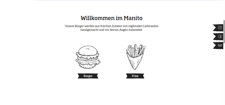
Menu shouldn`t be on another page
It kept the same layout across all breakpoints, even though the design should be adapted not only in layout but also in meaning to fit all breakpoints.
It kept the same layout across all breakpoints, even though the design should be adapted not only in layout but also in meaning to fit all breakpoints.
Layout is the same
Mobile Text is too long for mobile users
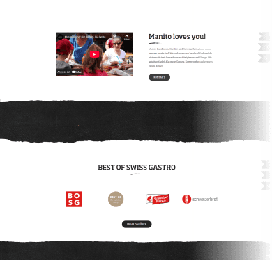
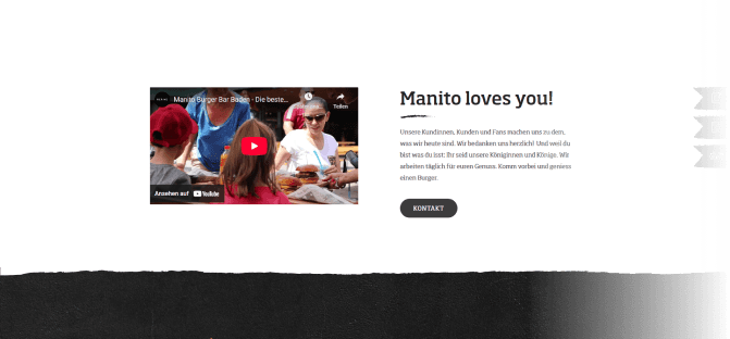
Manito is a rather recognized burger joint, meaning it has a lot of authority. Unfortunately, the website didn’t use that authority efficiently, which is a shame because authority can be a very helpful tool against competitors.
Manito is a rather recognized burger joint, meaning it has a lot of authority. Unfortunately, the website didn’t use that authority efficiently, which is a shame because authority can be a very helpful tool against competitors.
No clearly displayed Testimonials
Awards hidden beneath many Sections

Page Directory
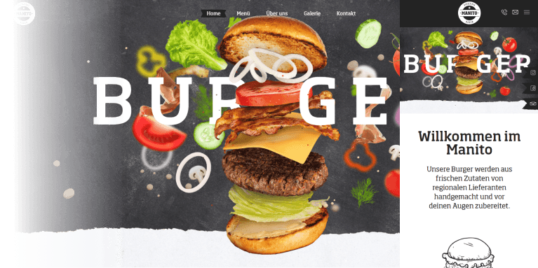
My redesign is simple yet efficient. I used the decent imagery Manito already has in a more stylish way to complement the website. I made small adjustments to the branding and maintained a consistent design ecosystem. I incorporated testimonials and awards to emphasize authority. Additionally, I researched the pains customers face that Manito solves and clearly defined these issues on the redesigned website.
My redesign is simple yet efficient. I used the decent imagery Manito already has in a more stylish way to complement the website. I made small adjustments to the branding and maintained a consistent design ecosystem. I incorporated testimonials and awards to emphasize authority. Additionally, I researched the pains customers face that Manito solves and clearly defined these issues on the redesigned website.